Interactive Fan Simulation

Group Project
Unity 3D, Blender
5 weeks
Project Overview
This project was a group assignment based off of a vaguely worded premise given to us by a hypthetical company. In the scenario given the company are sellers of ventilation solutions to industry and office buildings. They had previously made their own animated presentations in-house, but wanted something with a bit more "oomph" for a convention that was to take place in Germany.
My Contributions
I primarily worked on researching what industry standards we were to follow during the course of the project, what things were meant to look like, and the design of the fans themselves (covered in more detail below). I also did some of the 3D modelling, concept art, and acted as the informal Creative Director for the group I worked with.
This is the earliest bit of concept art I contributed to the project, with the intent to give a basic idea of the final outcome.

When we began to hash out the details of what should be in the project, we first needed to figure out how to rephrase what was requested into something we could actually work with. A convention presentation with a bit of  extra "oomph" isn't much to go off of.

The idea we ended up going with was something along the lines of an interactive commercial, wherein we would demonstrate the superior quality of our clients ventilation systems over other competing buisnesses.

First we needed a way to switch the ventilation systems . Then we needed a way to see the individual fans performance compared to each other, as one criteria mentioned specifically was that the clients ventilation system had a minimum 15% less energy drain compared to its competitors.

But we also needed a way for the fans performance to be directly visible to whoever was interacting with the aplication at the convention floor other than through numbers, and we got the idea that the air quality (and by extention the quality of the fans themselves) should reflect on how the workers in the given space acts.

And for the general controlls, we went with something along the lines of The Sims series.

To summarize, the systems we planned to put in place were:
* Switchable ventilation systems (both the pipes and the RTU)
* Some basic statistics (Watts, Decibels and airflow via M3/h)
* The behavior of the workers change depending on the installed system
* Camera that when controlled focuses on a single point, similarly to The Sims
I didn't contribute with any of the coding for this project (with one minor exception), but I did make the fans (or rather the RTU's) that are meant to be swapped out. Each one is meant to be an upgrade of the other, even if in reality they aren't. The point was more for them to be visually distinct over 100% factually accurate.

The one I first modeled was the biggest and the one that was meant to be the best performing. The other two are scaled-down versions of the biggest one with components moved around or removed.

Each of them are also animated by me.
The designs of the fans are more-or-less 1-1 recreations of the fans shown in a video by the YouTube channel The Engineering Mindset*.  

His videos were very helpful in doing research for this project, especially design-wise since what sources I could find on ventilation systems were a bit obtuse on what the different colors of airflow actually meant (orange being old stale air pumped out, and the red being filtered and heated air pumped in, if you're curious).

We were cautioned ahead of time to be as accurate as possible when it came to industry standard color-coding, as it is a good and easy detail to get right. And something that will get noticed immediately if you get it wrong.
The next part of the ventilation system are the actual vents, and their sub-components.

Each part was modeled individually for the sake of molecularity inside the Unity project, so that when assembled the parts can be placed and copy/pasted as necessary. This was to help with ease of use when placing and making new vent networks.

All the holes in the square components were made using the round pipes as a reference, to make sure they fit together as seamlessly as possible.
The next thing to show are the tiles used in the Office scene.

The Tiles, like the vents, were designed first and foremost to be modular. On top of that, I also designed their UVs to be nearly the same between them so I didn't need to make new textures for each and ever single one of them. This panned out for the most part, with some earlier bouts of carelessness requiering some of them to be redone.
In addition I also made the layout of the scene, as well as the earliest placement of furniture in the scene. The actual furnishings would later be done and placed by Bell, who was the one responsible for modelling everything else that I wasn't.

The layout was designed after I consulted with people who actually work in office buildings. I forewent things like fire exits, because this isn't meant to be a realistic office building, just close enough.
A bit into the project, we also came to the conclusion that it might be interesting to see the way the air flows through the vents.

The particle systems to show this were put in place by Gustav, but with some consultation from me to show which way they were supposed to flow.
There are also these guys.

They are the ones you see react in various ways when a fan is switched out. I modeled, UV-mapped and textured them, however I did not animate them, that's once again Gustav.

Each appear in one of the two scenes available in the simulator, the office, and a warehouse respectively.
I designed the appearance of the various UI elements too.

The ones used for buttons was meant to resemble a steel grate, while the ones used for text boxes were inspired by line paper. There are two versions of them, with the rightmost version of each being used.

Speaking of the text boxes, similarly to the ability to see the airflow mentioned in the section above, we also came to the conclusion that since this is meant to be used at a convention, it is also meant to get people to stay in the client company's booth for as long as possible. And hopefully leave an impression with the one paying a visit.

So we (more specifically Martin) made a system where certain components could be clicked on, and you'd get a bit of information about the component clicked on. On top of the appearance of the panel itself, I also wrote all the bits of info on all of them.
While we were a bit more in the experimental phase of the project, a feature I wanted to include was the ability to optionally remove the walls to peer inside more freely.

The way we experimented doing this was by exploiting Unity's built in occlusion culling, making one side of a wall visible while the other could be seen through.

The idea was scrapped because we couldn't get it to look good, and in the end it proved to be unnecessary.
In addition to the office worker, I also modeled a female version that could walk around alongside the other office workers.

Whether it be due to time constraints, or the male office worker being androgynous enough for it to not matter, this model went unused.
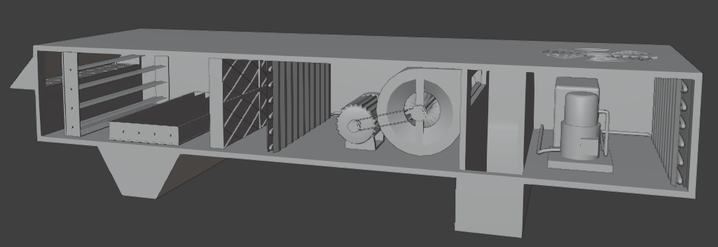
Here are some things I made for the project that either never ended up geting used, or are just a bit too different from the above to organically squeeze in elsewhere.
‍Misc/unused stuff
These are an Elevator and a coat rack I made, because Bell had forgotten to add them, and I needed something to do that day.

Am pretty happy with how they turned out.
A possible UI sprite inspired by a whiteboard that never ended up getting used.
The singular bit of coding I contributed to the project, was the exit button.
Feel free to check out some of my other projects.